Getting started with your first portfolio - Part 3: Adding CSS & implementing responsive web design
- Create a file called
styles.cssin the same directory asindex.html - Add the following line before the enclosing
</head>tag inindex.html
<link rel="stylesheet" href="styles.css" />
Element Selector
If we add this into styles.css, all of the text inside the enclosing p elements will be italicized
p {
  font-style: italic;
}
pis the selector - this is the element we want to stylize- each of the lines within the curly brackets
{ }is a particular style that will be applied to the element selected (pin this case)

While adding a CSS selector will select all HTML elements with a selected attribute, this may not be what we want. We will instead give the p element a specific identity that we can style. We will do this by adding a class attribute.
Class Selector
Classes define particular styles for all elements that share the same class name.
.cool-class {
  font-weight: bold;
  color: green;
}
Corresponding HTML code if we wanted to use this class in HTML
<h1 class="cool-class">Hemlo frens</h1>

ID Selector
Similar to class selectors, we can set an ID to an HTML element using the id attribute. How this is declared in CSS:
#cool-id {
  color: blue;
}
Using this id in an HTML element
<p id="cool-id">much amaze</p>
😎 Pro tip
You might think that ID and class do the exact same thing - you're not wrong! They just have different usages
- ID: for unique instances of an element (e.g. one unique button style that is different from the others)
- class: for repetitive cases (e.g. items listed in bullet points under the same list)
CSS Grid
CSS grid is used to structure your webpage into columns and rows
- first we define how the rows and columns are structured in terms of percentages
- for each element we then decide on which cell to put it in
This is important, because we need to make sure that our content is responsive across different screen sizese
Example of 2 x 3 table
| 1 | 2 | 3 |
|---|---|---|
| 4 | 5 | 6 |
To make this table, we do the following
.grid-table {
  display: grid;
  grid-template-rows: auto auto;
  grid-template-columns: auto auto auto;
}
display: gridtells the browser that this is a grid containergrid-template-rowsandgrid-template-columnsset the dimensions for rows and columns respectivelyautowidth/column means our grid is flexible - this grid could end up looking very asymmetric depending on the content
HTML
<div class="grid-table">
<div>1</div>
<div>2</div>
<div>3</div>
<div>4</div>
<div>5</div>
<div>6</div>
</div>
😎 Pro tip
You can use percentages/pixels instead of auto, e.g.:
- 50% 50%
- 300px 300px
- 4rem 4rem
Mobile Responsiveness
A three-column display on a normal desktop screen may not necessarily look good in a mobile display. When building your site, it's important to design for cases where the user is not viewing your site from a desktop browser, but from their mobile device instead.
Media Queries
A media query is a block of CSS code that only runs if a given condition @media (<condition>) is met
Example
.grid {
  display: grid;
  grid-template-columns: 100%;
}

@media (min-width: 600px) {
  // breakpoint 1: run this code if the minimum width of screen is 600px
  .grid {
    grid-template-columns: 50% 50%;
  }
}

@media (min-width: 900px) {
  // breakpoint 2: run this code if the screen is at least 900px wide
  .grid {
    grid-template-columns: 1fr 1fr 1fr;
  }
}
grid-template-columnsets either one column of100%, two columns of50% 50%, or three columns of1fr 1fr 1fr(three equal-sized columns)display: gridandgrid-template-columns: 100%applies to both media queries, so we don't need to add them again
Positioning our portfolio
- We want to add some margins around the content of our portfolio to give it more space to "breathe". We'll create a
containerclass
<body>
  <div class="container">
    <!-- all of our existing content goes here -->
  </div>
</body>
.container {
  max-width: 840px;
  margin: 0 auto;
}
margin: 0 auto;means no margin for top-bottom, and auto margins for left-rightNow we'd like to center-align our intro headline
Let's make a new class called
intro
<div class="intro">
  <!-- content goes here -->
</div>
.intro {
  text-align: center;
}

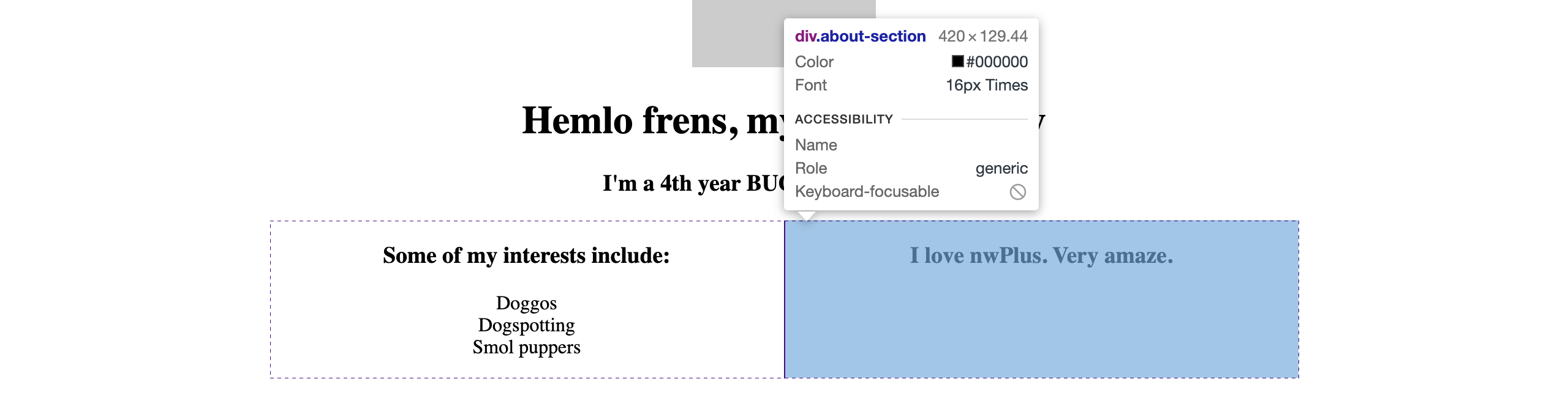
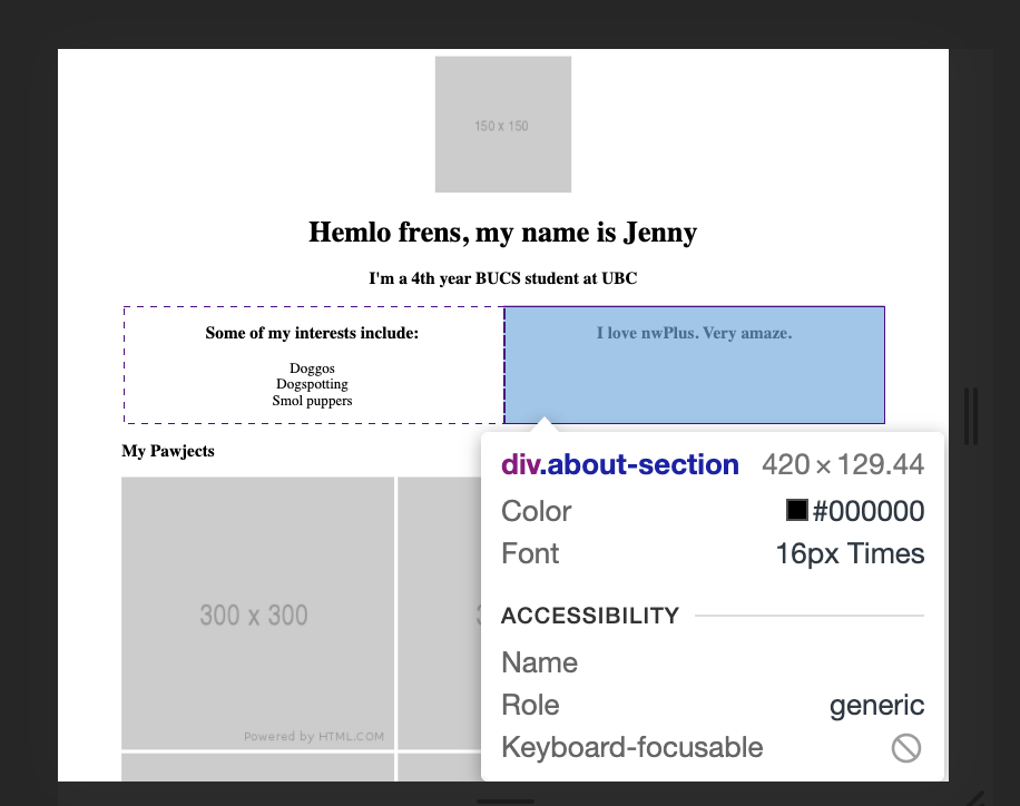
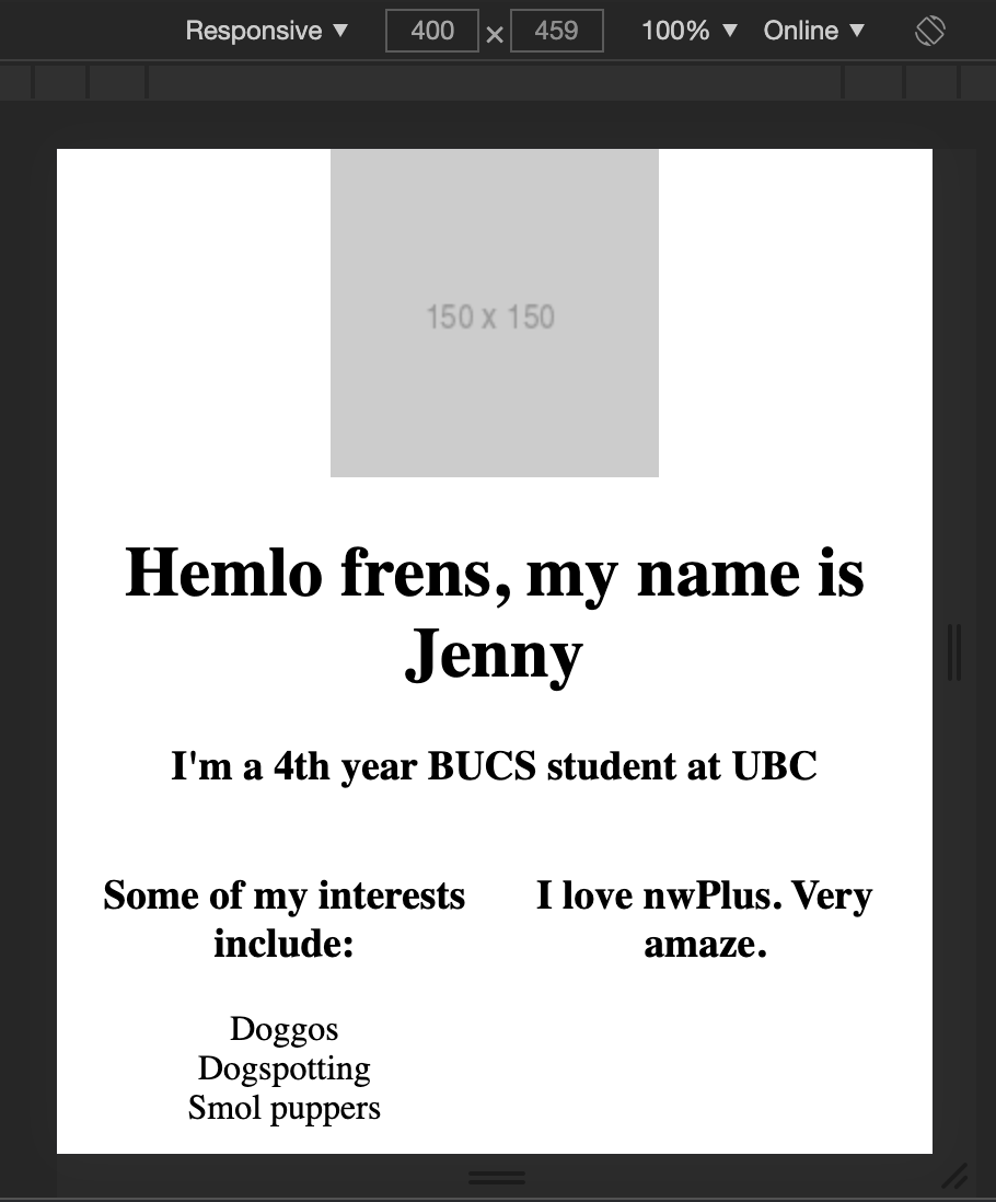
- Let's arrange the about portion to have two columns with the first half on the left and second half on the right
<div class="about-grid">
  <div class="about-section">
    <p>I love nwPlus. Very amaze.</p>
  </div>
  <div class="about-section">
    <p>Some of my interests include:</p>
    <ul class="about-list">
      <li>Doggos</li>
      <li>Dogspotting</li>
      <li>Smol puppers</li>
    </ul>
  </div>
</div>
.about-grid {
  display: grid;
  grid-template-columns: 50% 50%;
}

.about-section {
  text-align: center;
  text-decoration: none;
}

.about-list {
  list-style: none;
  padding: 0;
}

To simulate a mobile screen, we can do cmd+(or ctrl)shift+m. Notice how the content looks very disproportional, like a zoomed-out version of the desktop site
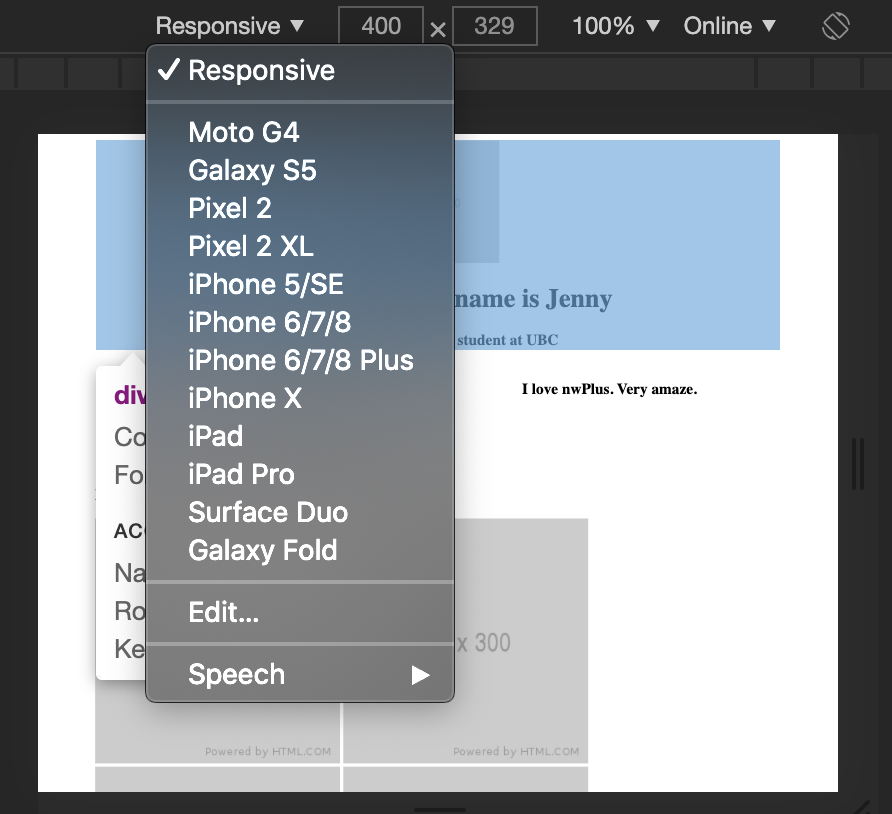
we can make our site more responsive by instructing our browser to show the webpage in mobile size
- Let's add this
metatag before the closingheadtag
<head>
  <meta charset="utf-8" />
  <!-- existing content in the <head> element -->
  <meta name="viewport" content="width=device-width, initial-scale=1" />
</head>
metaallows you to control the dimensions and scaling of a pagewidth=device-widthsets the width of page to follow the screen-width of the deviceinitial-scale=1.0sets the initial zoom level when the page is first loaded
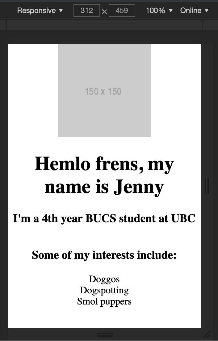
- Another thing we'd like to do is have the about sections one below another on mobile devices. Let's write a media query for that, defining the breakpoint as
480px
@media (max-width: 480px) {
  .about-grid {
    grid-template-columns: 100%;
  }
}
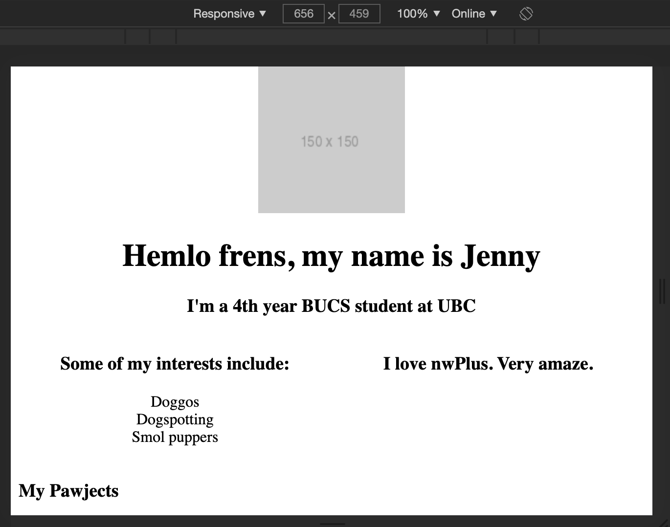
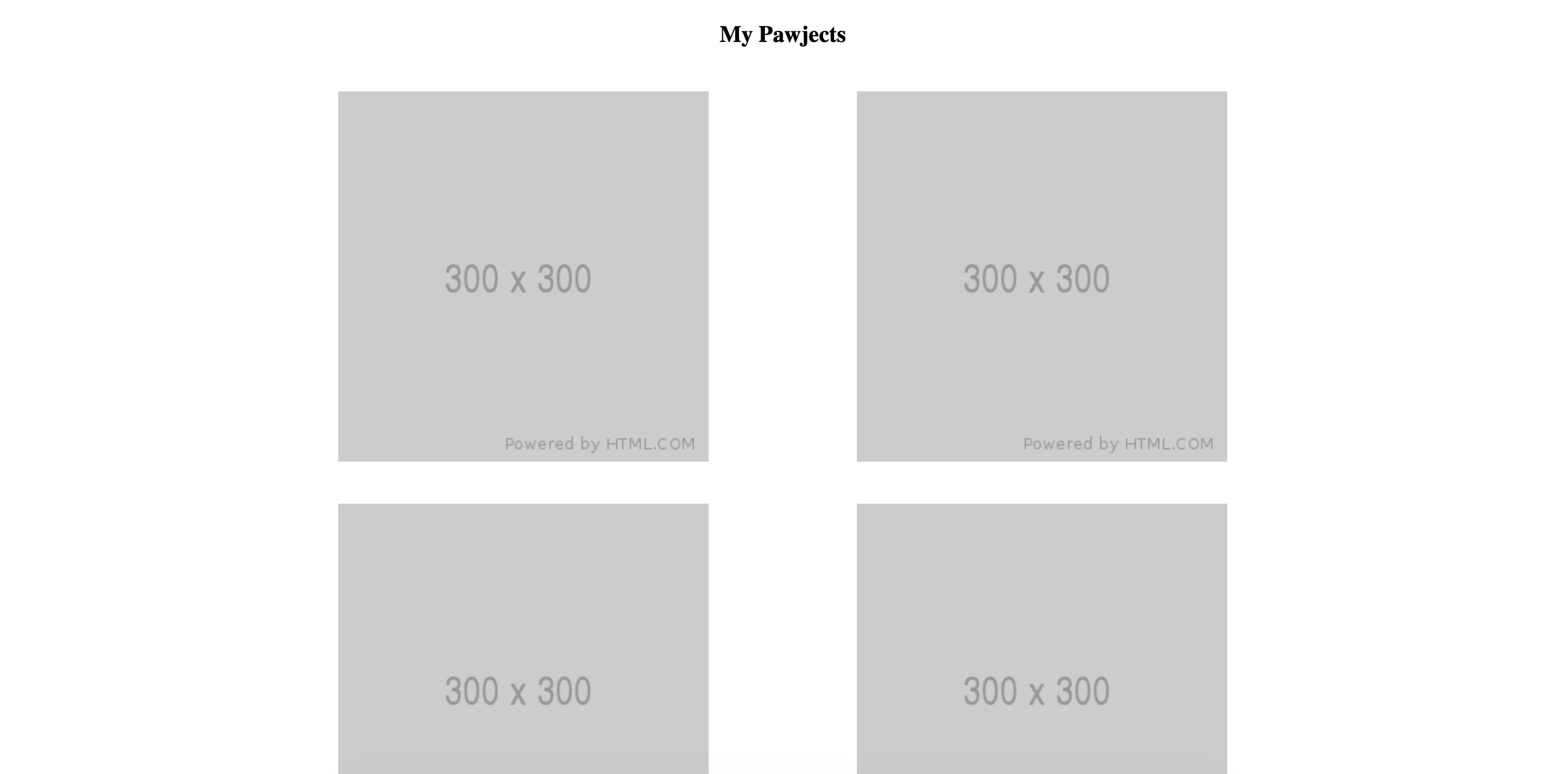
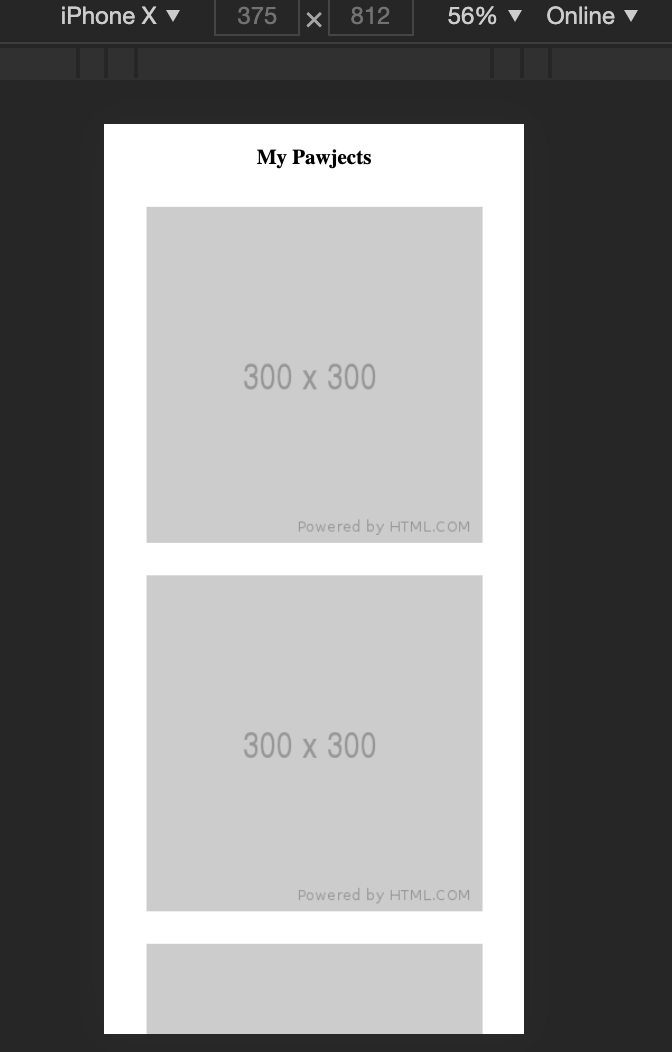
- Let's make similar changes to the projects section - 2x2 on desktop, 4x1 on mobile
<h2 class="heading">Pawjects</h2>
<div class="projects-grid">
  <img class="project-image" src="https://via.placeholder.com/300" />
  <img class="project-image" src="https://via.placeholder.com/300" />
  <img class="project-image" src="https://via.placeholder.com/300" />
  <img class="project-image" src="https://via.placeholder.com/300" />
</div>
.heading {
  text-align: center;
}

.projects-grid {
  display: grid;
  grid-template-columns: 50% 50%;
}

.project-image {
  justify-self: center;
  padding: 4%;
}
@media (max-width: 650px) {
  .projects-grid {
    grid-template-columns: 100%;
  }
}
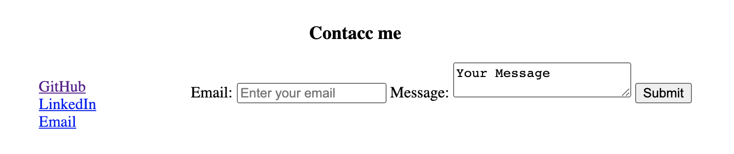
- Let's split the contact section as well, by 30-70
<div>
  <h3 class="heading">Contacc</h3>
  <div class="contact">
    <div class="links">
      <h4>Links</h4>
      <ul class="links-list">
        <!-- List items -->
      </ul>
    </div>
    <div>
      <!-- Contact form -->
    </div>
  </div>
</div>
.contact {
  display: grid;
  grid-template-columns: 30% 70%;
}

.links {
  justify-self: center;
}

.links-list {
  list-style: none;
  padding: 0;
}

@media (max-width: 650px) {
  .links-and-contact {
    grid-template-columns: 100%;
  }
}